theHUB
A premium local business directory for East Tennessee
Overview
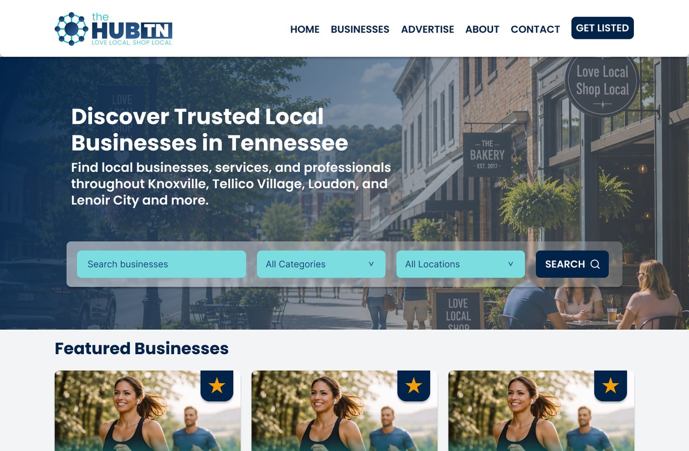
theHUB (thetnhub.com) is a live local business directory serving Knoxville, Tellico Village, Loudon, and Lenoir City, Tennessee. Unlike free directories, it’s built as a premium visibility platform: businesses pay monthly for exposure, placement, and prominence. I took the project from first client conversation to developer-ready hi-fi designs — discovery, information architecture, UX flows, wireframes, brand application, and a documented design system.
The problem
Residents and newcomers in these communities had no centralized, trusted way to find local services — and local businesses had no affordable way to be visible beyond word of mouth. The client’s goal: launch with 40–50 listings across 30+ categories, mobile-friendly, easy for a single owner to manage, and structured to grow.
The design challenge was the business model itself: the product sells visibility. Every layout decision — what’s featured, what’s sponsored, what ranks first — is also a revenue decision. The UI had to monetize placement without eroding user trust.
Discovery & strategy
I ran a structured discovery phase and documented it before any design work: business goals, competitor analysis, a tiered revenue model (Standard / Featured / Spotlight listings), sitemap, 32 launch categories, navigation structure, search & filter strategy, URL structure, and SEO structure.
Two decisions from this phase shaped everything downstream:
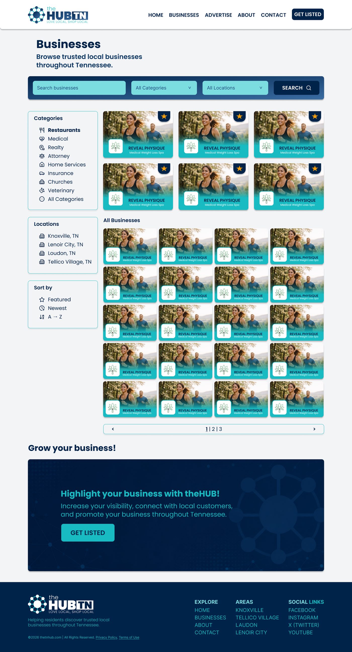
- Categories became filters, not pages. A separate categories page would fragment browsing; instead, the Businesses page carries keyword search plus category and location filters in one place.
- Featured-first ordering, honestly labeled. Paid tiers surface first in results, but always with a visible “Featured” badge — paid prominence users can see is placement; paid prominence users can’t see is deception.
UX flows & wireframes
I documented five core user flows — browse, search, category navigation, submit business, and contact business — then translated them into lo-fi wireframes for all six page templates.
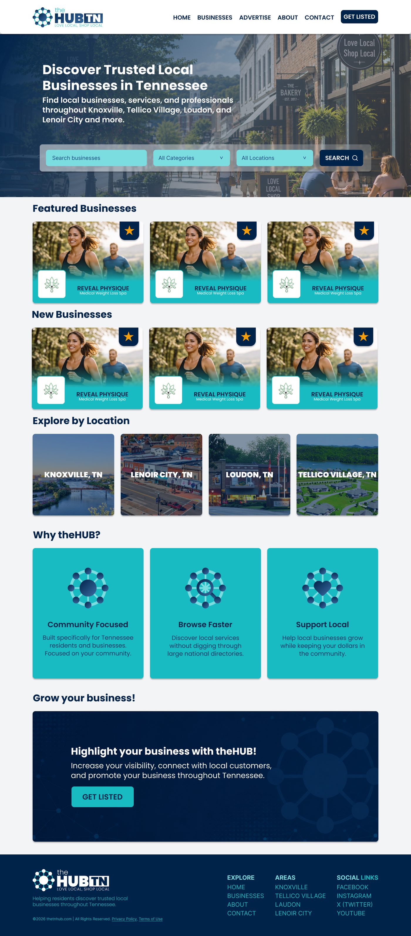
The two primary personas pull in different directions: a resident wants to find a trusted plumber in seconds, while a business owner wants to evaluate whether a Featured listing is worth $69.99/month. The homepage serves both — search-first hero for residents, with featured placements and a clear “Get Listed” path for owners.
The design system
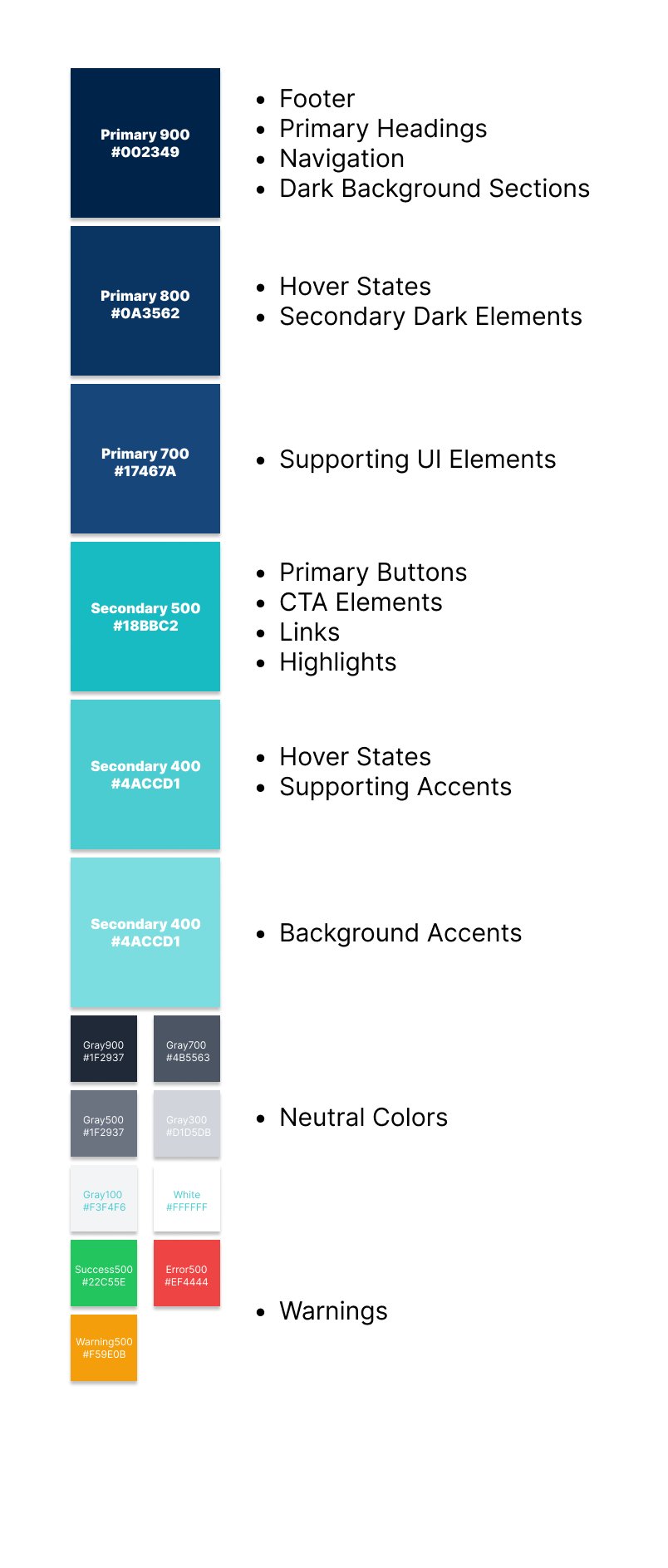
I built the brand and UI foundations as a documented system: a navy-and-teal palette (Primary #002349 → Secondary #18BBC2) with semantic status colors, Poppins across a 7-step type scale, a 12-column / 1200px grid, and a component library — business cards, benefit cards, pricing cards, navigation, footer — with logo usage rules and clear-space specs.
Hi-fi designs
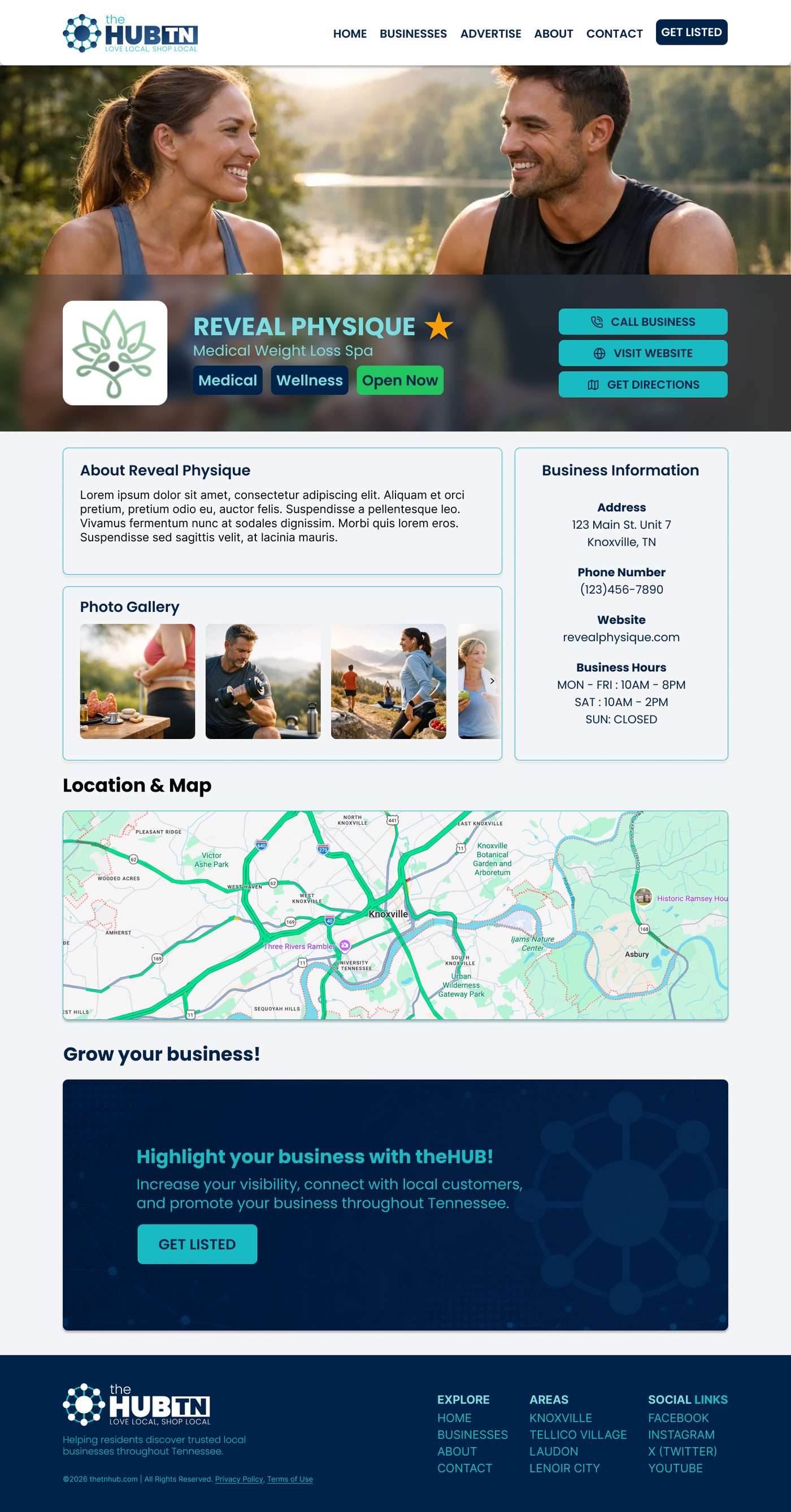
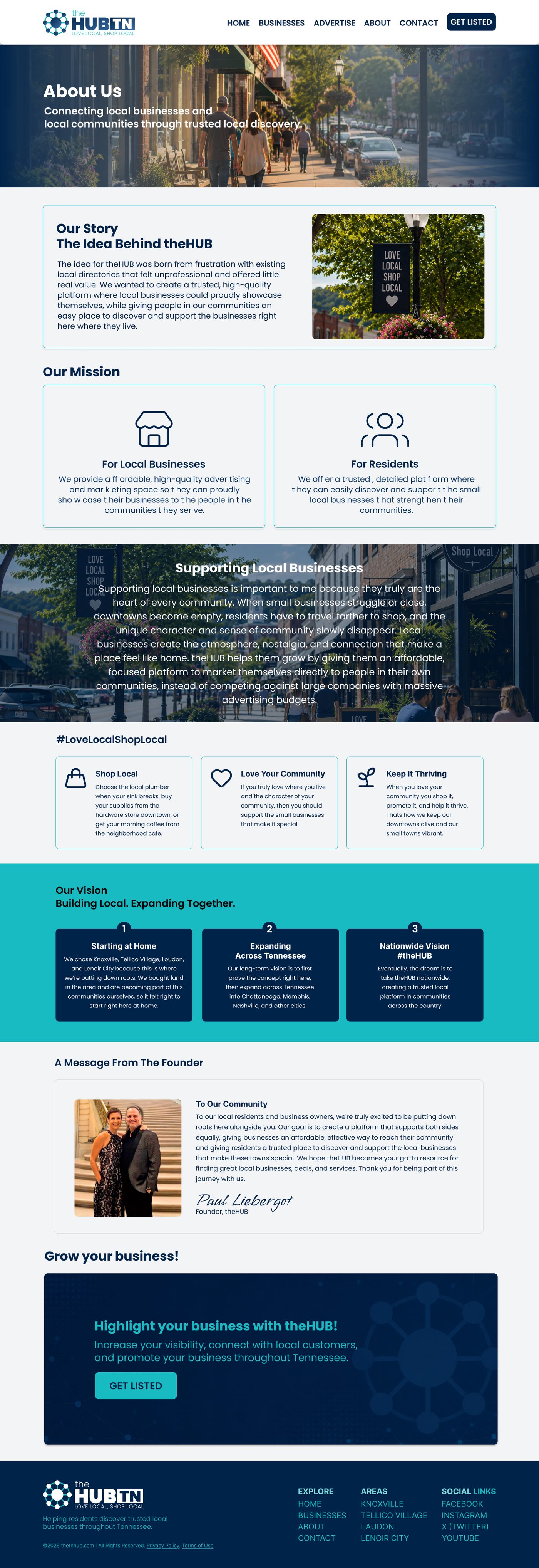
The final screens apply the system across the full page set. The business detail page does the heaviest lifting: it’s simultaneously the user’s decision point (“can I trust this business?”) and the product’s upsell showcase (“this is what prominence looks like”).
Outcome & reflection
The site is now live at thetnhub.com. The client received a complete package on the way there: discovery documentation, five UX flow specs, lo-fi wireframes, a design system, and hi-fi designs for every template. This project taught me that in a marketplace product, information architecture is the business model — where a listing appears isn’t just navigation design, it’s the thing being sold, and the user’s trust is the constraint that keeps it honest.