Mati Modern Greek
A restaurant website that books tables, not just views
Overview
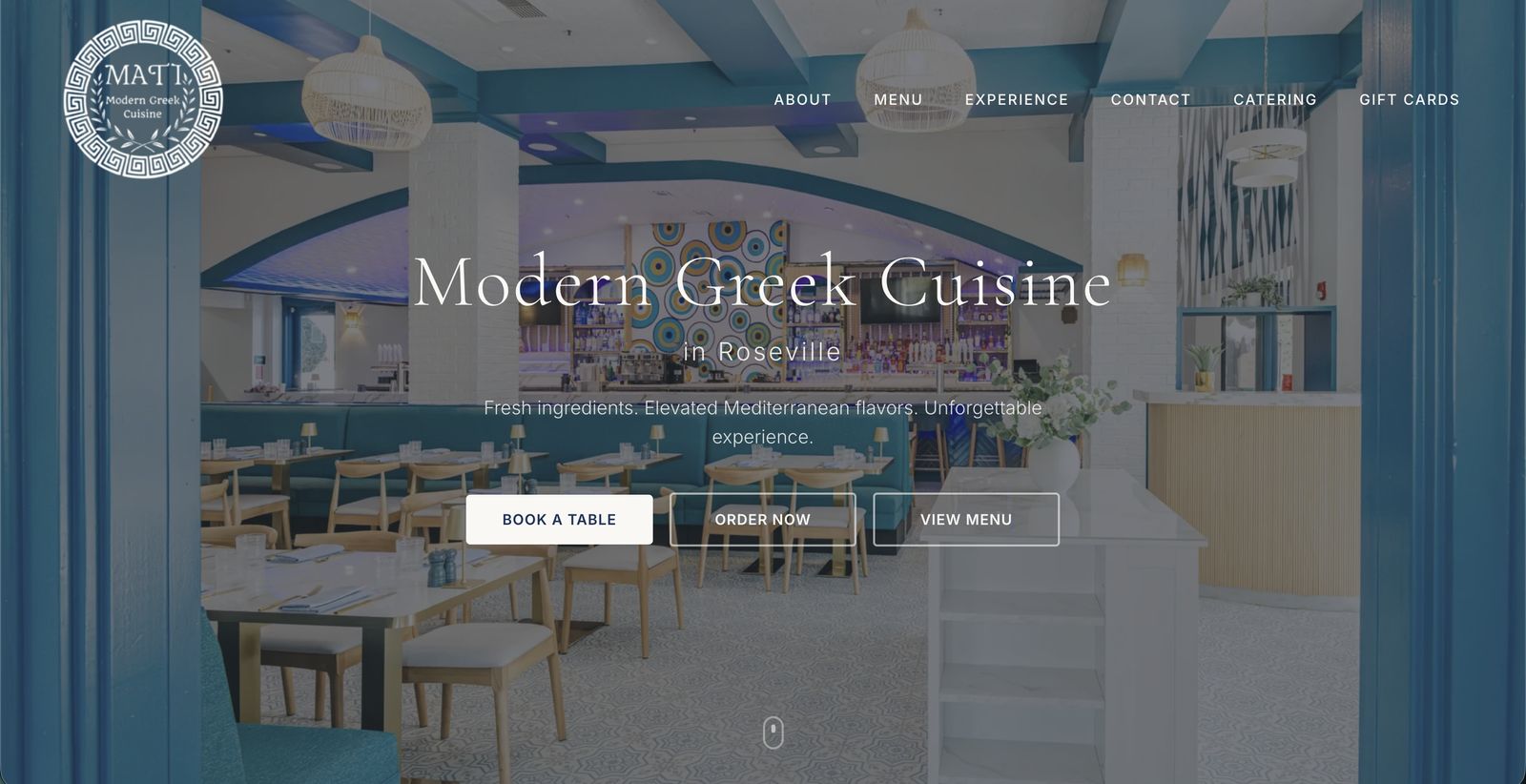
Mati Modern Greek is an upscale-casual Greek restaurant in Roseville, California. I designed and built their website end to end — from art direction in Figma to the live, responsive site at matiroseville.com. The brief was simple to say and hard to do: make the site feel as good as sitting in the room, and make it effortless to book a table.
The problem
Restaurant websites usually fail in one of two ways: they’re a static brochure that hides the menu in a PDF, or they’re a delivery-platform page with no soul. Mati’s interior — Aegean teal, warm wood, hand-painted mati (evil eye) motifs — deserved better, and the business needed the site to carry real weight: reservations, online ordering, catering inquiries, and gift cards.
Art direction
The design system comes straight from the room. A cream canvas
(#FAF8F5) plays against deep navy and Aegean teal, with gold as the
accent — the palette of the dining room’s tilework and brass. Type pairs
Cormorant Garamond, a high-contrast serif with Greek-inscription
elegance, with Inter for UI text. The Greek key pattern lives in the
logo roundel; the mati motif appears in the photography itself — quiet
details, never theme-park Greekness.
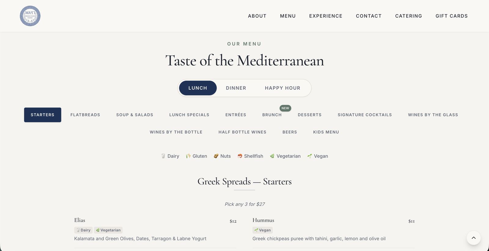
The interactive menu
The menu is the most-read page of any restaurant site, and it’s where I spent the most design effort. The old approach — static PDF menus — is gone entirely, replaced with a fully interactive system:
- Service toggle — Lunch, Dinner, and Happy Hour are one tap apart, each with its own category set (Lunch adds Lunch Specials and a Brunch section flagged with a “NEW” badge).
- Category navigation — from Starters and Flatbreads to Signature Cocktails, three tiers of wines, Beers, and a Kids Menu — thirteen-plus categories that filter in place instead of forcing a scroll-hunt.
- Dietary tags at a glance — every dish carries chips for dairy, gluten, nuts, shellfish, vegetarian, and vegan. Guests with restrictions scan instead of interrogating a server.
- Menu logic, not just menu text — bundle pricing like “Pick any 3 for $27” on Greek spreads is presented as a rule of the interface, and updating a dish or price is a content edit, not a PDF re-export.
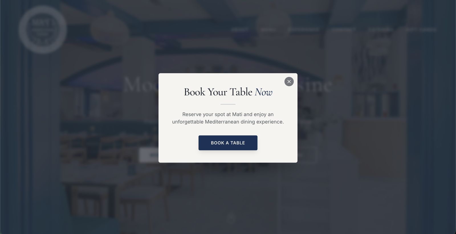
Conversion first
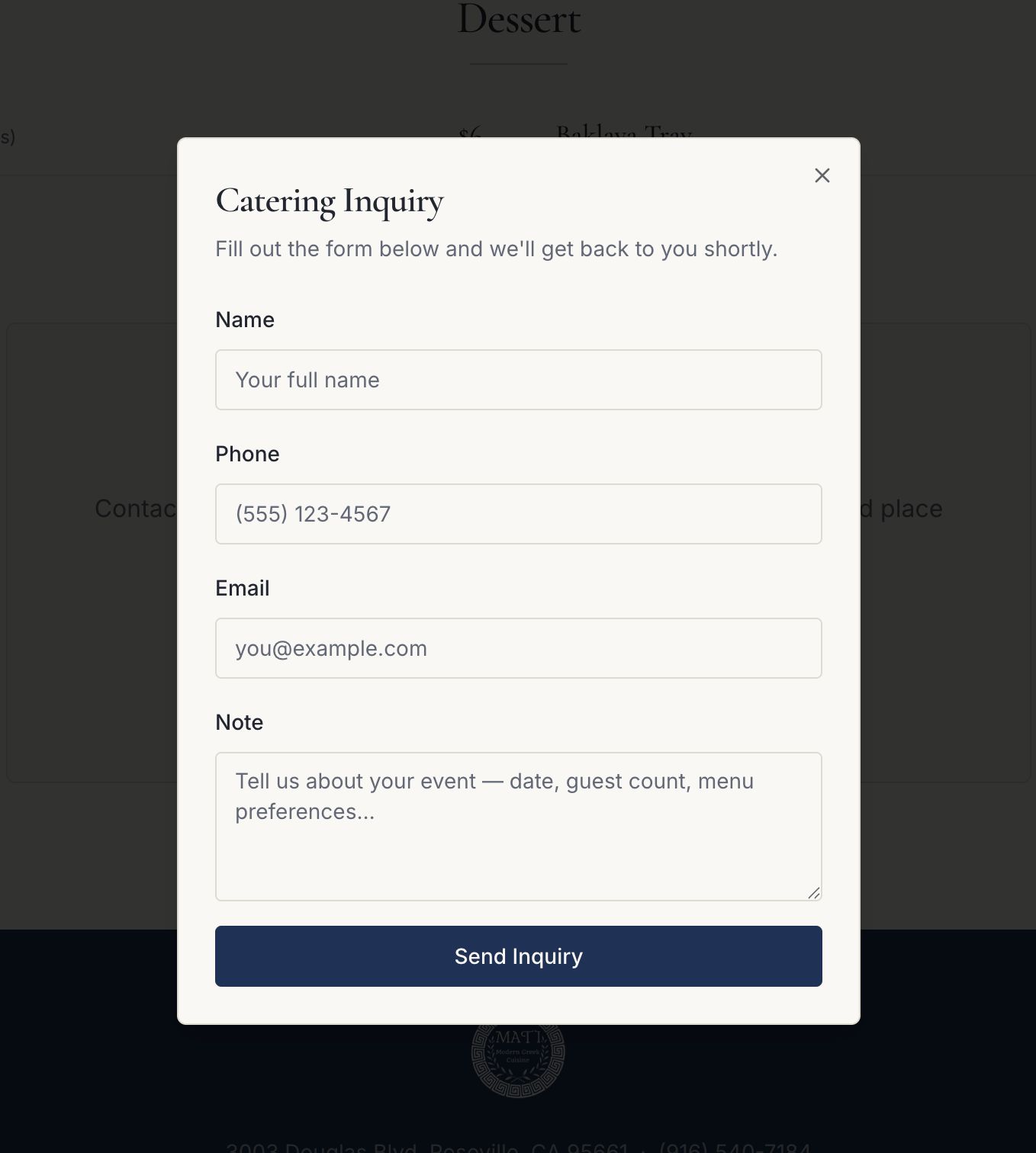
Every screen keeps three actions within reach: Book a Table, Order Now, and View Menu. A dismissible booking invitation appears on arrival — assertive enough to convert, polite enough not to annoy. Catering gets the same treatment: a dedicated nav entry opening a focused inquiry modal (name, phone, email, event note) so a high-margin lead never gets lost in a generic contact form.
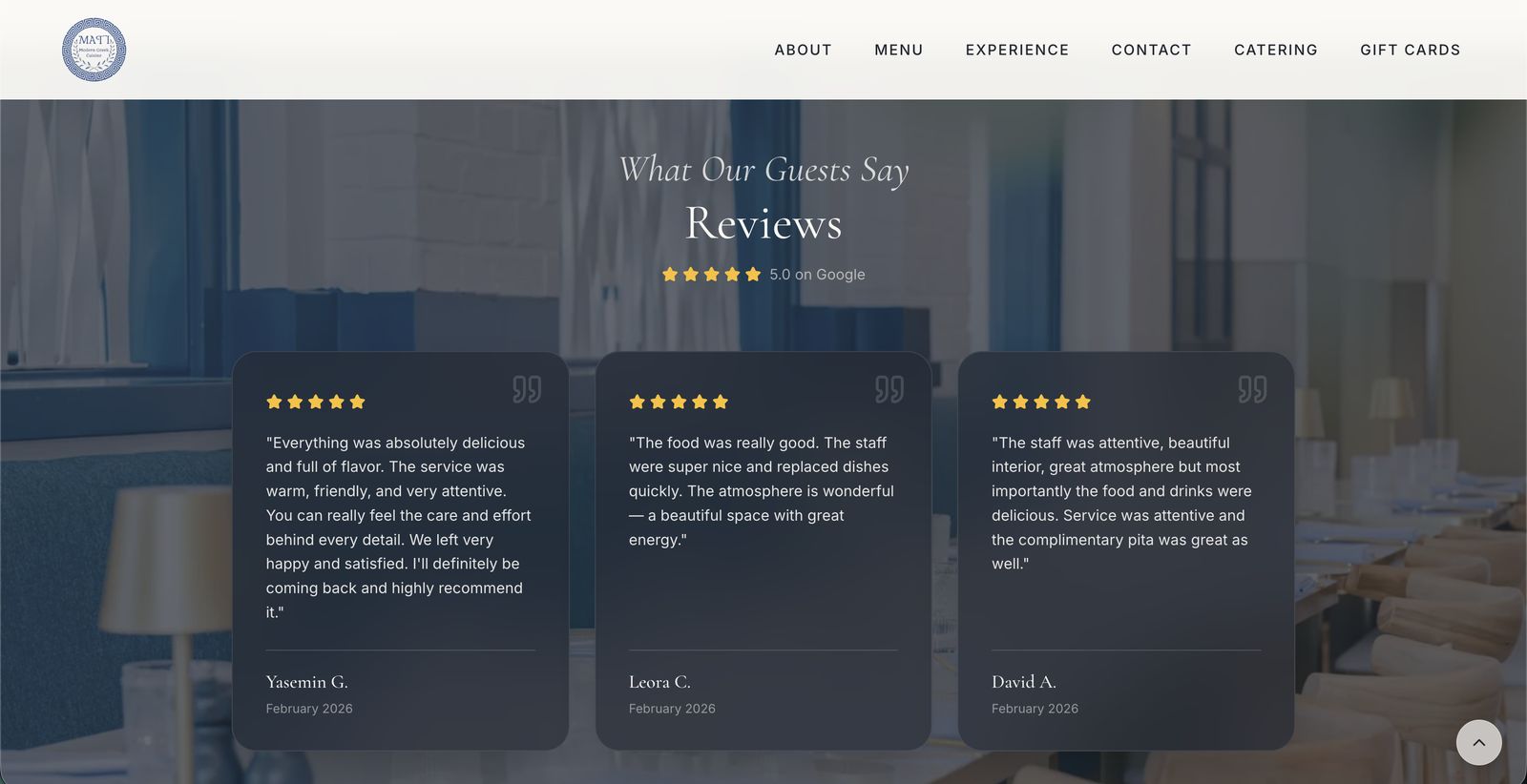
Social proof & practicalities
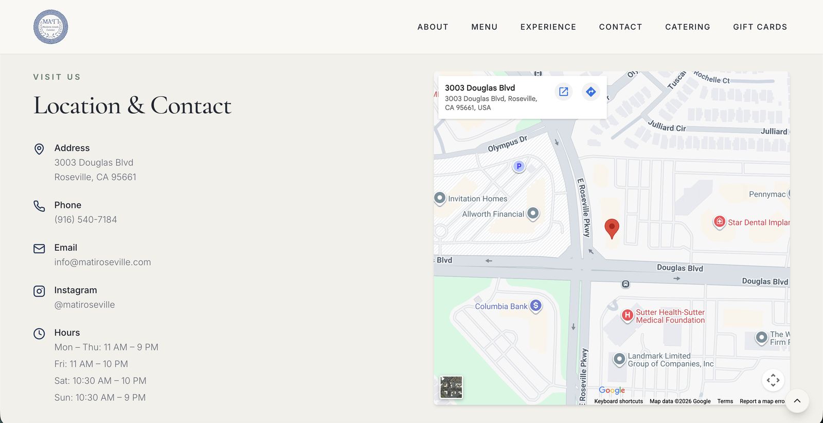
A reviews section surfaces the restaurant’s 5.0 Google rating with real guest quotes on glass cards over the dining room, and the contact block answers the four questions every visitor actually has — where, when, how to call, how to follow — with an embedded map and structured hours.
Outcome & reflection
The site is live and working for the business: reservations, online ordering, catering inquiries, and gift cards all flow through it. Designing and building it solo — Figma for the system, Lovable for the build — compressed the usual handoff loss to zero: the type scale, spacing, and color tokens on the live site are exactly the ones in the design file. It’s also a reminder that for a restaurant, the website is the first course — appetite and trust are designed long before the first bite.