Campfire
A social audio app that listens more than it talks
Overview
Campfire is a social audio concept designed around a simple observation: most audio platforms are built for talking, but most people come to listen. Over six weeks I took it from idea to a complete UX/UI case study — personas, user journeys, information architecture, a documented visual system, and hi-fi screens for the full core loop.
The problem
Social audio exploded and then faded because rooms felt like stages: raised-hand mechanics turned speaking into public speaking, joining signaled commitment, and leaving felt rude. The design question I set myself: what does social audio look like when it’s a hangout, not a broadcast?
Personas & journeys
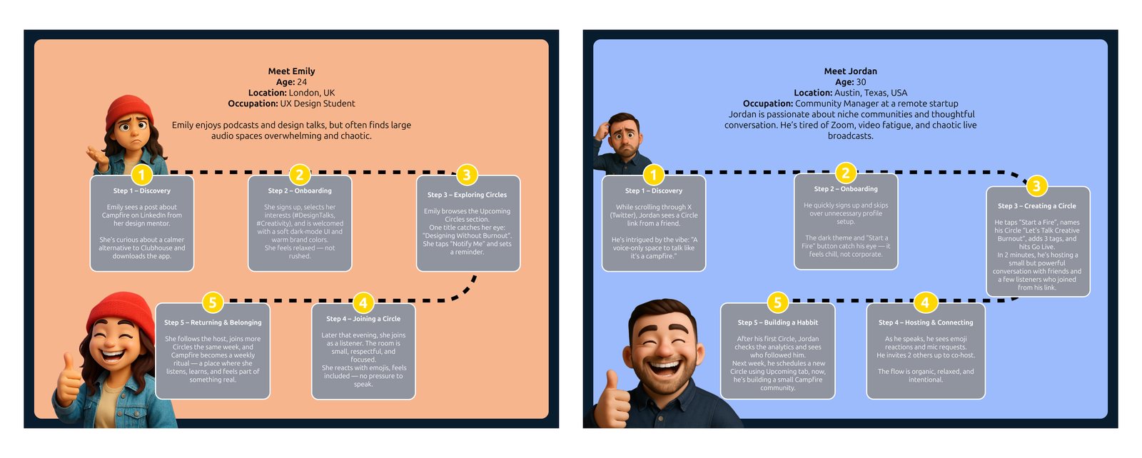
Two personas anchor the design, pulling from opposite ends of the spectrum. Emily (24, UX design student, London) enjoys podcasts and design talks but finds large audio spaces overwhelming and chaotic — she needs to listen safely before she ever speaks. Jordan (30, community manager at a remote startup, Austin) is tired of Zoom, video fatigue, and chaotic live broadcasts — he needs to host without it feeling like production work.
I mapped a five-step journey for each — from discovery and onboarding through joining (or creating) a Circle to the moment each of them feels they belong — and used those journeys to decide what the interface had to make effortless: anonymous listening for Emily, low-ceremony hosting for Jordan.
Information architecture
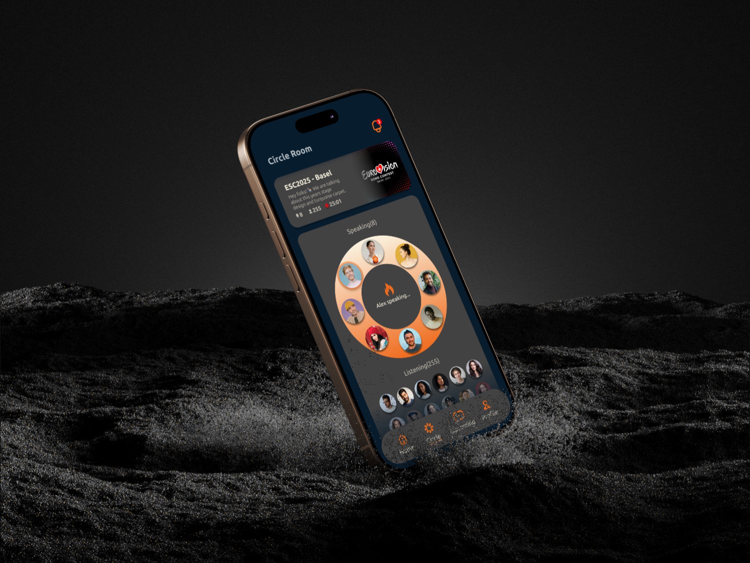
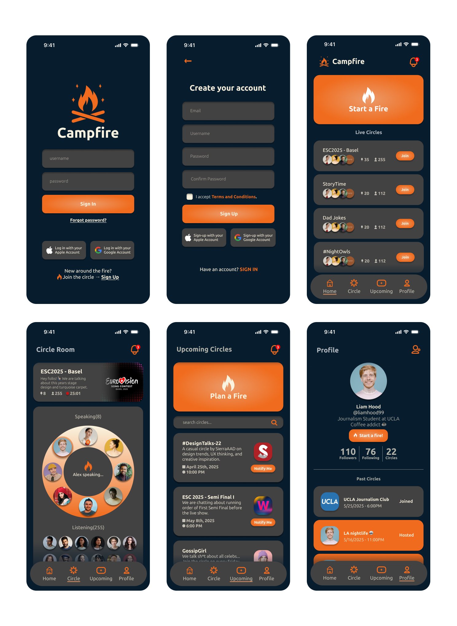
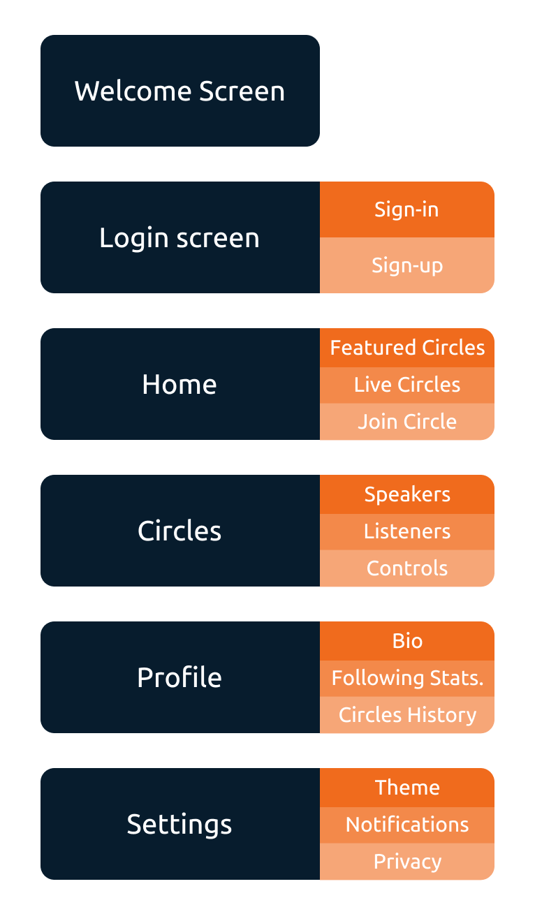
The IA is deliberately shallow: Welcome → Login → Home (featured and live Circles, one-tap join) → Circle Room (speakers, listeners, controls) → Profile (bio, following stats, Circles history) → Settings. No feeds, no DMs, no discovery rabbit holes — the product is the room, so everything else stays out of the way.
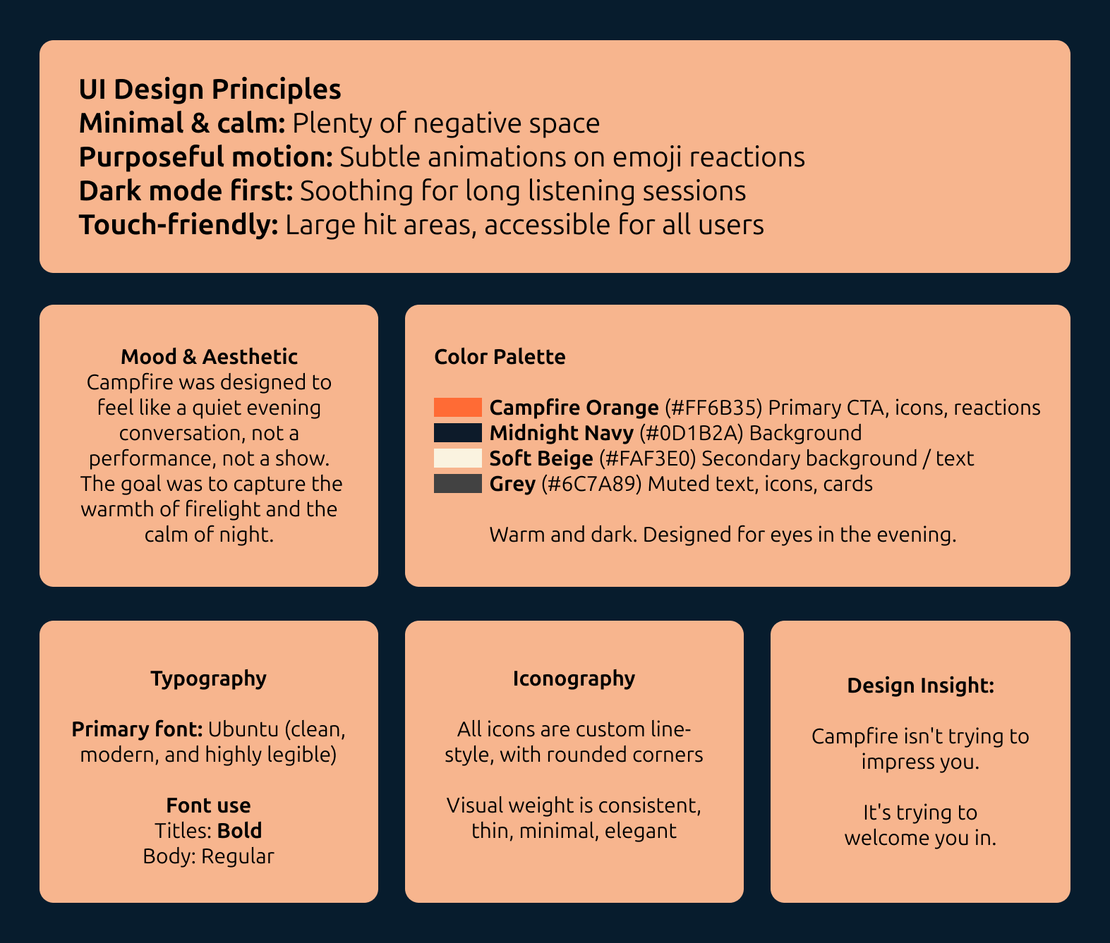
The visual system
The metaphor is in the name: conversations are fires, you “Start a
Fire” instead of opening a room, and the palette is a night sky around
a flame — Campfire Orange #FF6B35 for CTAs, icons and reactions
against Midnight Navy #0D1B2A, with soft beige #FAF3E0 and muted
grey #6C7A89 for text and cards. Four documented principles drive the
UI: minimal and calm (plenty of negative space), purposeful motion
(subtle animations on emoji reactions), dark mode first (soothing for
long listening sessions), and touch-friendly hit areas throughout.
Typography is Ubuntu; iconography is a custom line-style set with
rounded corners. The design insight from the file says it best:
“Campfire isn’t trying to impress you. It’s trying to welcome you in.”
Why it works
The mechanics answer the problems directly: smaller “Circles” feel intimate and manageable; you can listen anonymously before engaging; the casual “Start a Fire” format encourages real interaction instead of performance; and the warm, non-corporate language keeps the whole thing feeling like a laid-back, voice-first hangout.
Outcome & reflection
The final file covers the complete loop — onboarding, live Circles, the Circle Room with emoji reactions, planning upcoming Circles, and profiles. Designing Campfire reminded me that digital products don’t have to be loud, fast, or attention-grabbing to be valuable — sometimes users are looking for peace, presence, and connection. Next time I’d add real user interviews and usability testing, and prototype more of the micro-interactions (emoji reactions, mic requests). Campfire started as a design exercise; it became a reminder that tech can feel human when we design it with empathy.