Designing a social audio experience for spontaneous, calm and connected conversation.
Overview
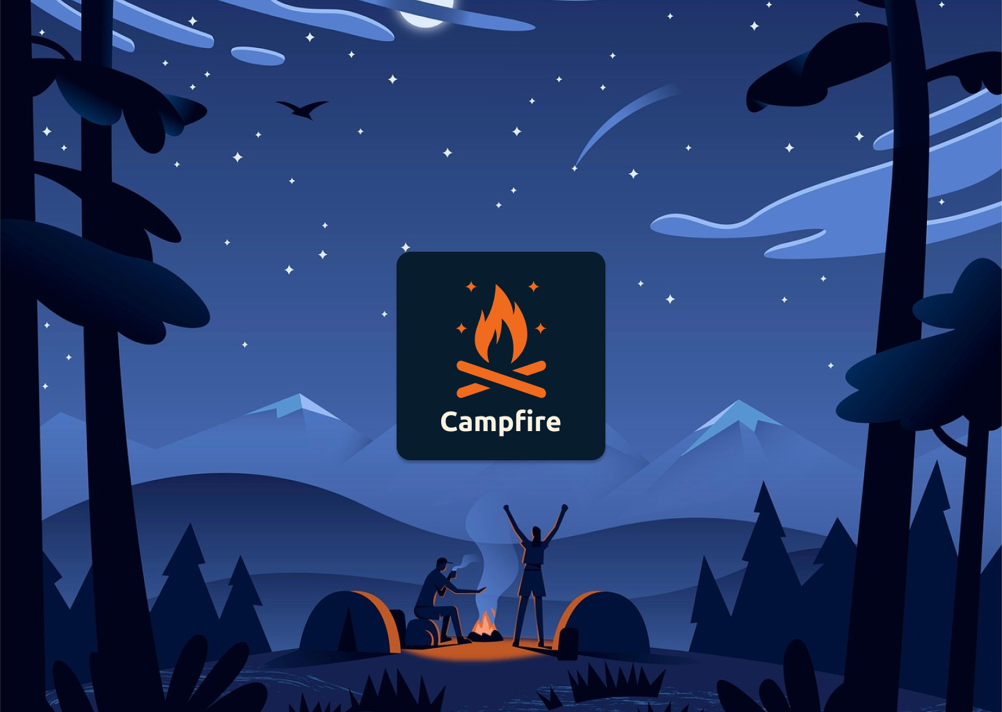
Campfire is a conceptual mobile UX/UI design project created to reimagine how people engage in real-time voice conversations. Inspired by the warmth and intimacy of a real-life campfire, the app aims to offer a cozy and emotionally engaging space, a peaceful alternative to crowded, impersonal audio platforms like Clubhouse or Twitter Spaces
This solo project was completed over 2 weeks as part of a personal challenge to develop a complete UX/UI case study for my design portfolio. I led the entire process, from UX research and wireframes to branding and final UI mockups.
Problem
Social audio tools are great for voice-driven conversation, but the current UIs often feel too chaotic, formal or crowded. Users have trouble finding relevant rooms, knowing who’s speaking, and participating easily.
Goal
Create a voice-first experience that feels welcoming, easy to browse, and easy to join in. Use warm metaphors like gathering around a fire to create visual clarity and a calm mood.
Personas

Emily Tran (24, UK) – A UX student seeking calm and inspiring spaces.
Jordan Williams (30, USA) – A community builder wanting intimate, no-camera spaces.
Jonas Weber (29, Germany) – A listener-focused developer tired of video overload.
Emily's journey as a Listener
1. Discovery → Learns about Campfire via a mentor’s post.
2. Onboarding → Chooses interests in a calm, dark UI.
3. Browsing → Finds a talk and taps 'Notify Me'.
4. Joining → Listens quietly, reacts with emojis.
5. Belonging → Returns weekly, feels connected.
Jordan's journey as a Speaker
1. Discovery → Finds Campfire via a shared link on Twitter.
2. Onboarding → Skips fluff, appreciates chill UI.
3. Creating → Starts a Circle with friends in 2 mins.
4. Hosting → Receives emoji feedback and hand-raises.
5. Building → Schedules weekly Circles, grows a micro-community.
Visual Design
Icons
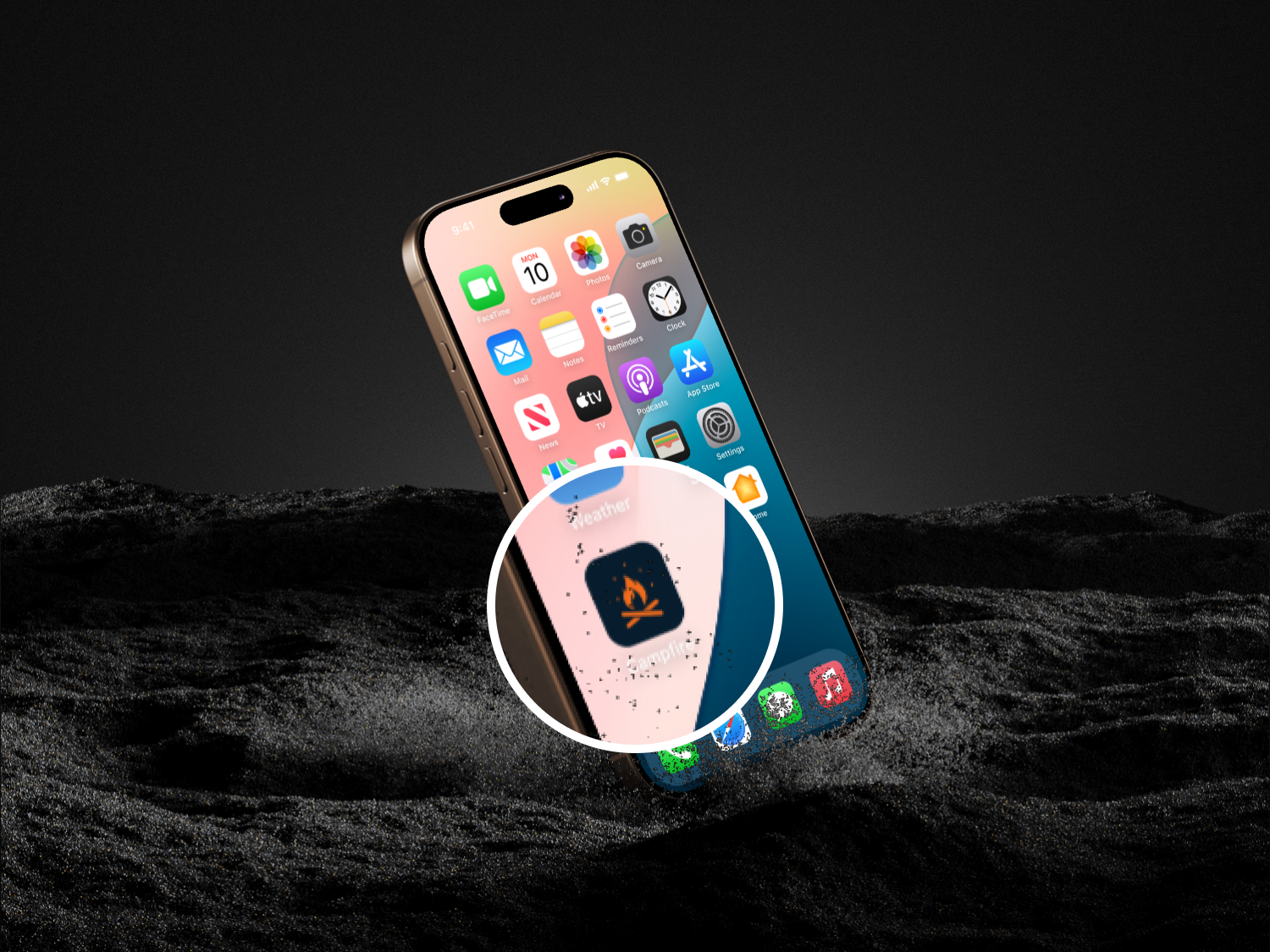
The icon set was built from scratch using Figma components for easy reuse and scalability. To reinforce clarity and friendliness, I designed a custom icon set using a bold outline style with rounded corners. The icons use a vibrant orange to align with Campfire’s warm brand personality and enhance visual recognition. All icons share consistent stroke width and visual weight, ensuring a cohesive look across the interface. Notification and status icons (such as the bell with a badge or the muted microphone) were designed to stand out without overwhelming the layout.
✦ Icons are not just decorative, they play a key role in guiding users, simplifying navigation, and communicating state changes in real-time audio environments.
Color System
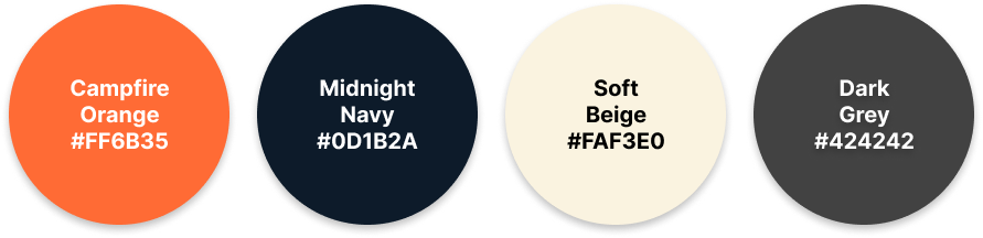
The Campfire color palette was designed to evoke warmth, depth, and calm and reflecting the emotional tone of spontaneous voice conversations.
Campfire Orange — Warm, bold, and energetic
Midnight Navy – Deep & calming
Soft Beige #FAF3E0 – Light & neutral
Dark Grey #424242 – Subtle & clean
Together, these colors create a mood that feels welcoming, focused, and distinct from typical tech UIs.
✦ The palette supports accessibility and contrast guidelines while reinforcing the emotional goals of the product.
Ideation
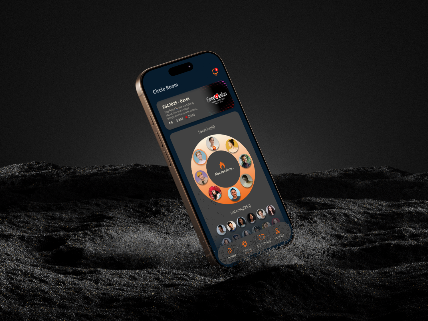
The campfire concept led to circular room cards, gradient glow indicators, minimal UI elements, and a visual room preview that feels intuitive and spatial rather than textual.
Reflection and Outcomes
Designing Campfire reminded me that digital products don’t always have to be loud, fast, or attention-grabbing to be valuable. Sometimes, users are looking for peace, presence, and connection.
This project allowed me to:
- Design for emotion, not just functionality
- Think deeply about tone, visual warmth, and user comfort
- Practice storytelling through personas and journeys
- Build a full UX/UI case study from idea to polished visuals
- Explore the difference between 'talking' apps and 'listening' spaces
What I'd do differently:
- Conduct real user interviews
- Prototype more interactions
- Explore a web/desktop version
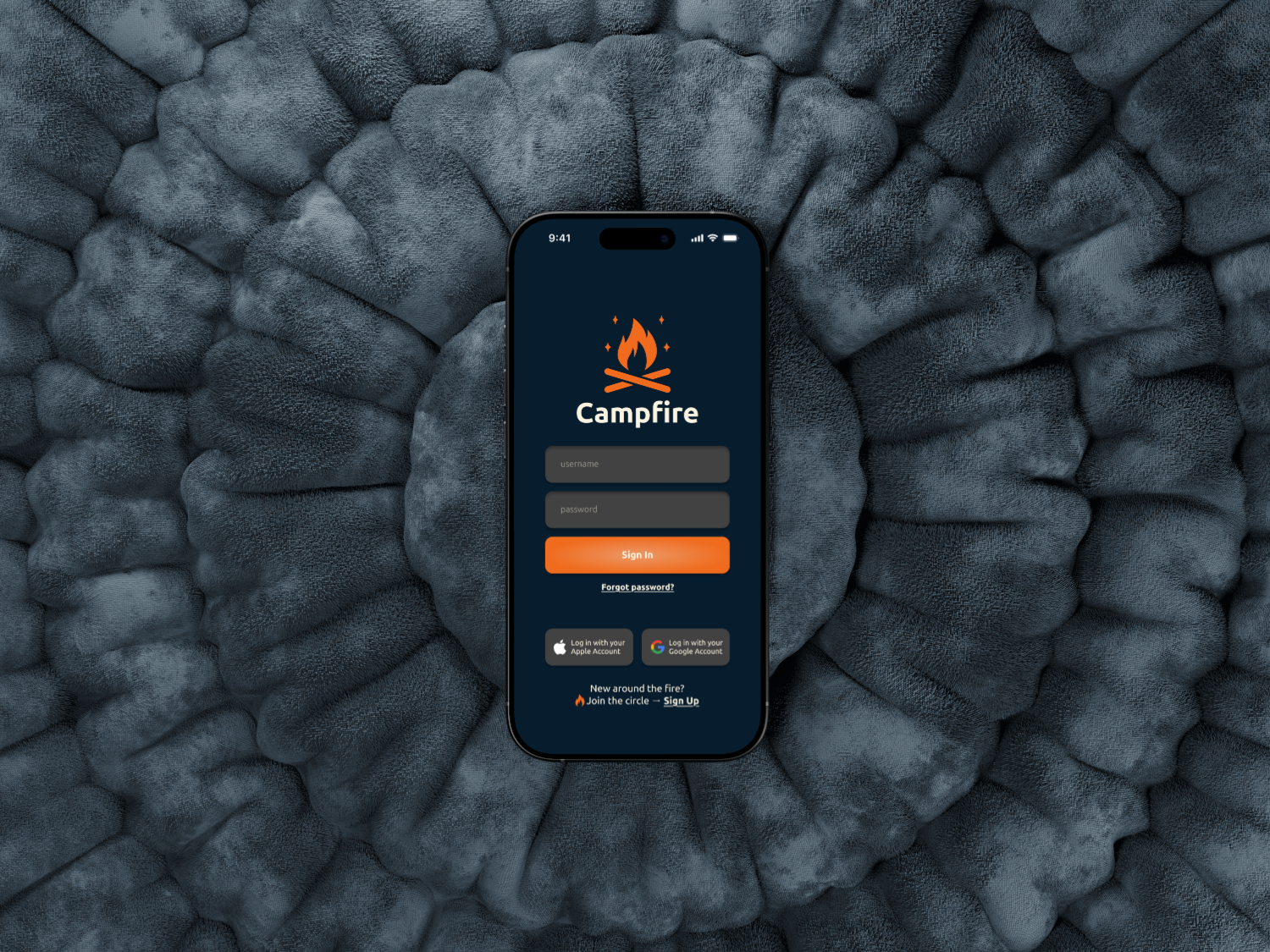
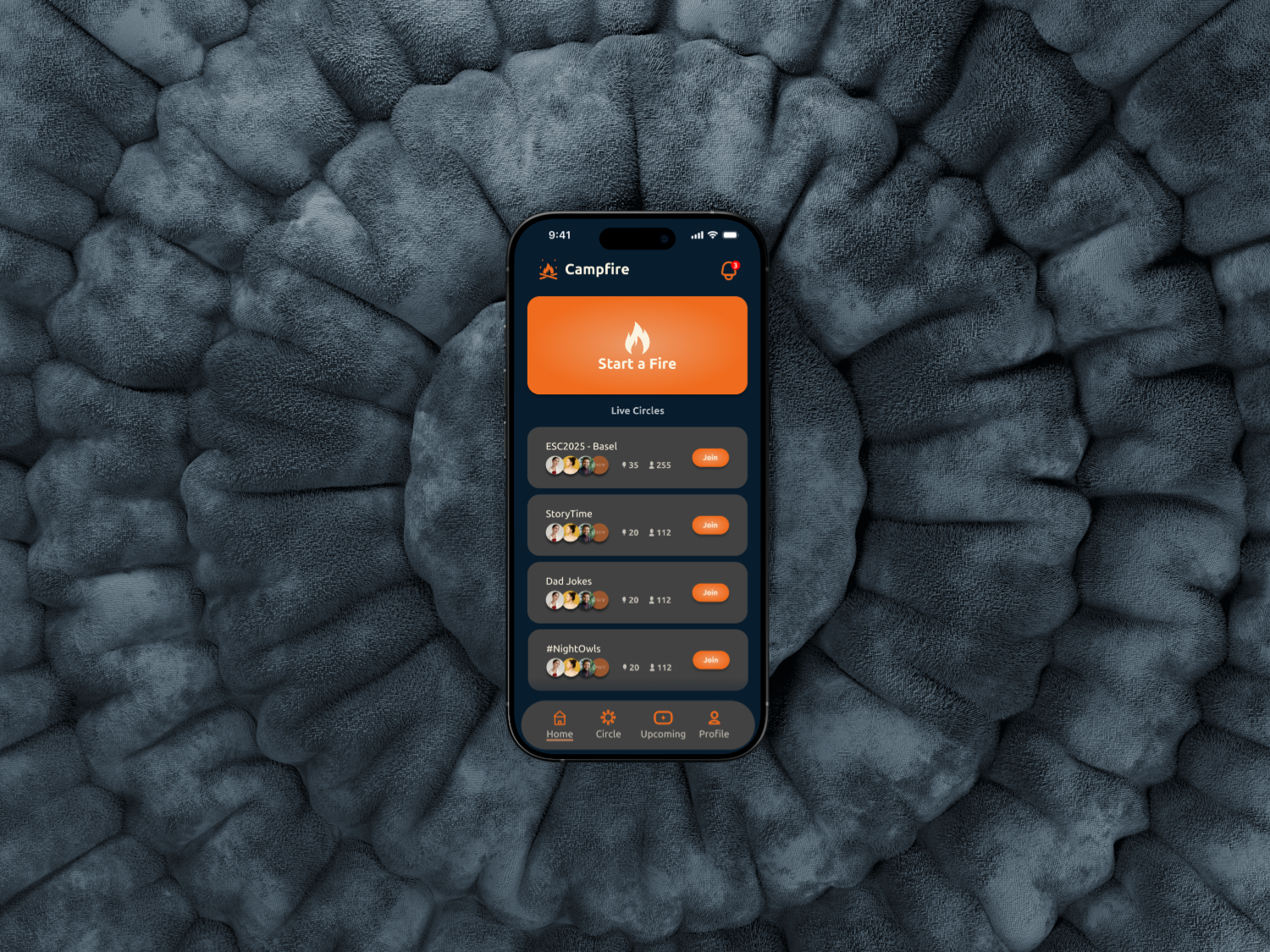
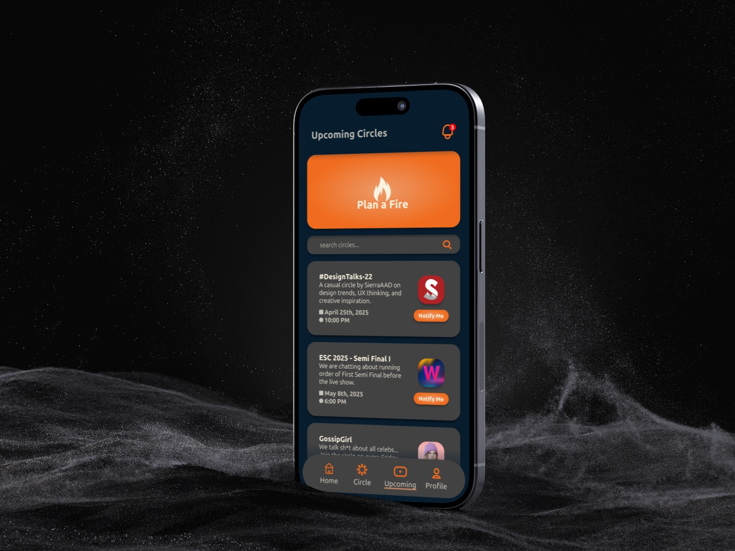
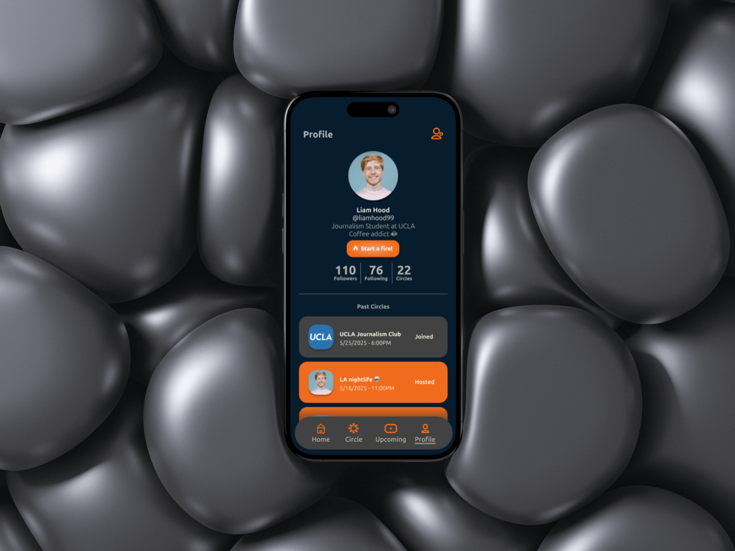
How it looks?
 Back to top ↑